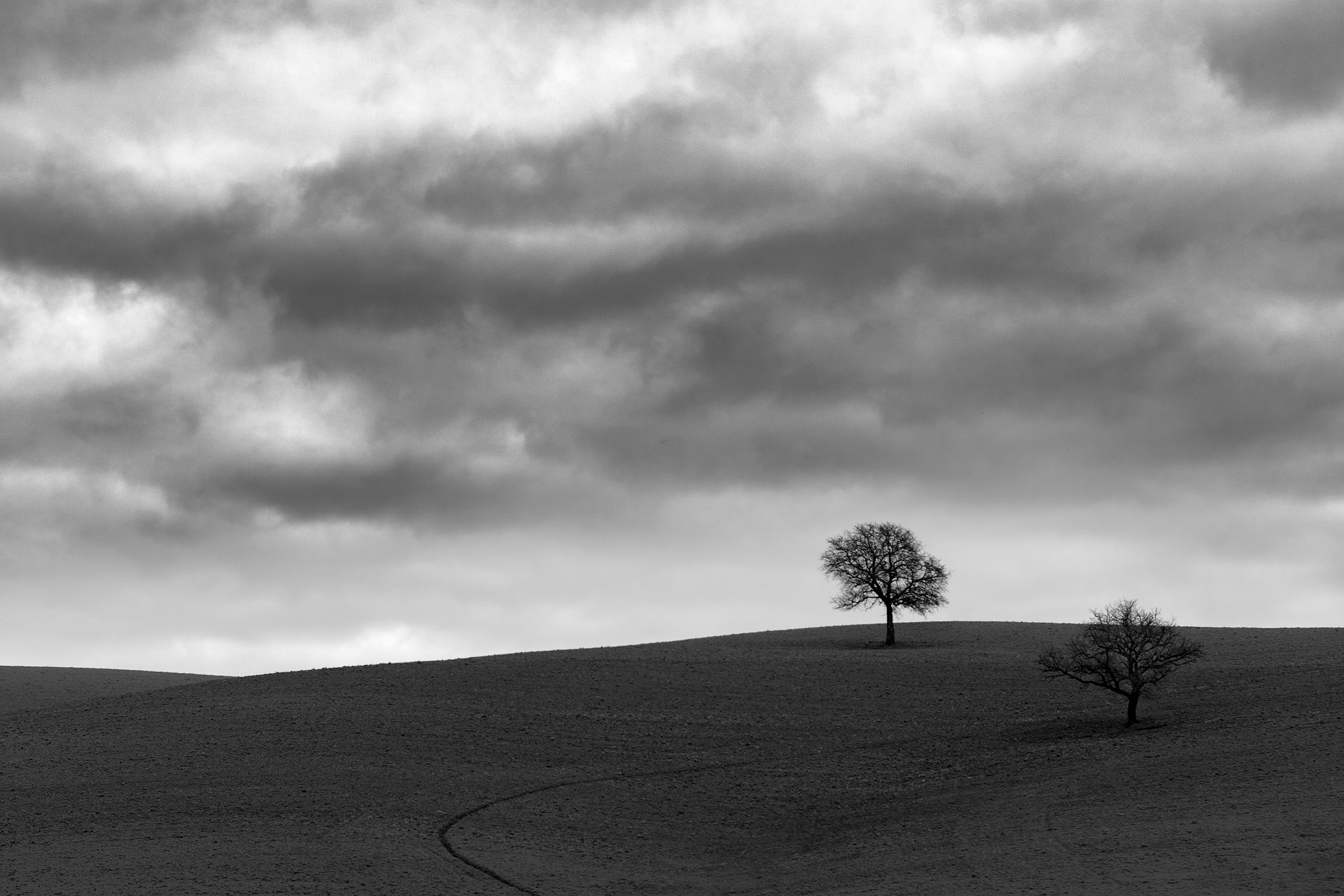
Since a good picture contains intense or less intense characteristics of composition -from now on- we’ll be having a thorough look at the steps of it (composition). Starting point is Space which can be divided in three basic categories: 1) the visual space in front of the camera, 2) the space as it appears on screen and 3) the spatial size and shape of the screen itself.
Checking the space in front of the camera:
On a 3 dimension world (height, width, depth), we’re trying to create the best 2 dimension images (height, width) which will be able to provide the sense of depth when appeared on screens (TV’s, PC’s, tablets e.t.c.) or hard copy. All the above lead to the conclusion that depth in photography is actually a hallucination and the actual real element appearing is perspective. There are images with one, two, or even three vanishing points which create the sense of perspective. For those vanishing points we’ll talk in details in a future post. Tonal differences can affect perspective (brighter tones appear closer to the viewer than the darker ones) while colour differences can also change perspective’s balance (warmer colours appear closer to the viewer than the cooler ones).
On the other hand, there a few ways to eliminate the vanishing points in order to create successful flat compositions such as textural diffusion (when we create textural difference on the background), shape change, tonal separation, colour separation, overlap, focus.
Another useful tool when it comes to space is limited perspective which separates the foreground from the background using colour and tonality, size separation, overlapping elements e.t.c.
Finally, there is also the ambiguous space created in front of the camera made through fuzzy shapes and sizes, mirrors and reflections, colour and different lenses (either wide or tele) which change objects’ perspective.
-
LATEST POSTS
Social Media
Contact
- +30 6937 78 58 07
- info@inbulbpw.com
- More about us


